 Schedule of Classes
 Maps
Maps Canvas
 Directory
 Library
 LancerPoint
 Calendars
 Bookstore
 Student Email
 News & Events
 Police & Safety
 PCC Connect
 Parking
 COVID-19 Info
Components
Introduction to Components
Components are a form-based type of content that gather information and add it into complex design elements. A component on a page prompts you to enter information and formats and displays the information on the page.
What Components Look Like
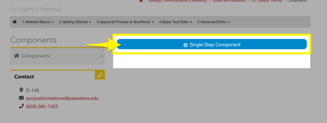
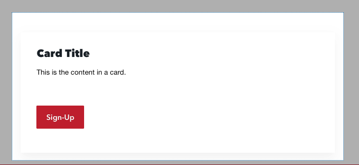
You may be wondering if you have any Components on your page. Once you are in the WYSIWYG editor, Components on a page may display in one of the following ways:
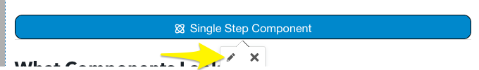
- A blue bar placeholder with the name of the component
- A preview of the component
-
Note: this varies depending on the component. The preview will look very similar to how the component looks on the live website.)
-
Editing a Component
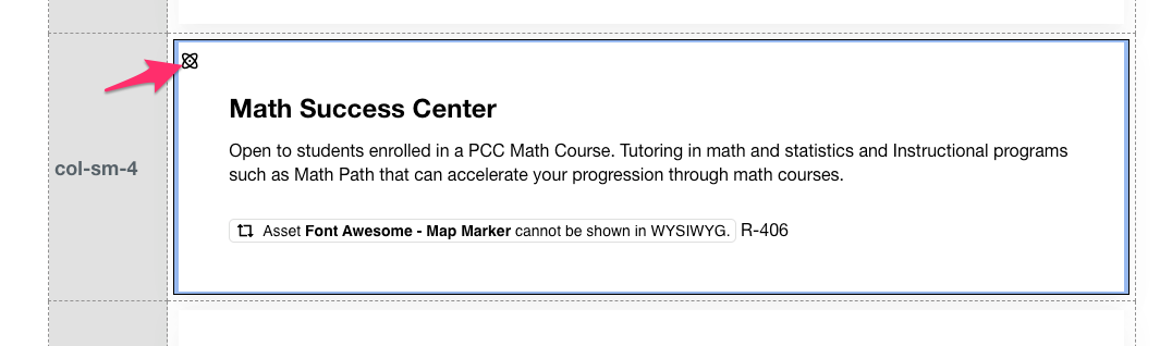
The content of a component is saved in a form. Use the steps below to open the component form and make edits.
- Hover over the top left corner of the component and click the icon that appears in the upper left corner.
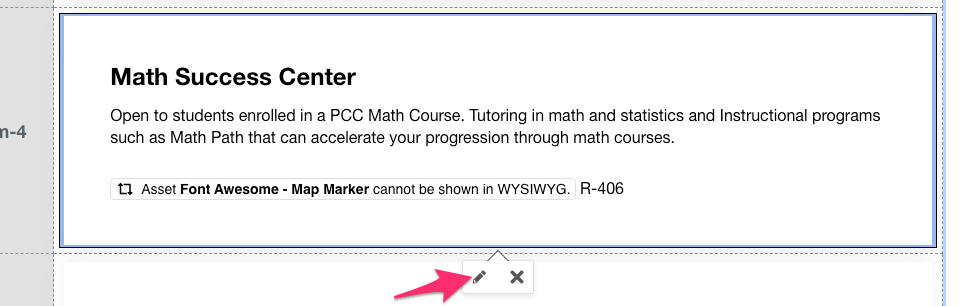
- Next, click the pencil icon that will appear at the bottom of the component.
-
Note: For components that appear as a blue bar, you can just click directly on the bar for the Pencil icon to appear
-
- The component form will open in a modal. It will show the available content of the
component. Make the changes you need to the various fields. When done making edits,
click the blue Save button.
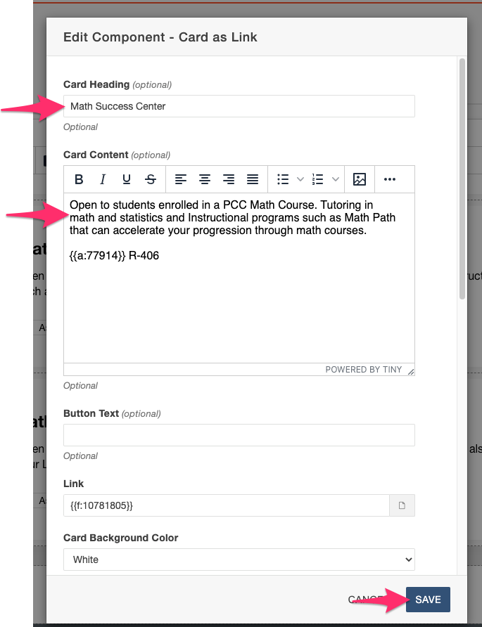
- Note: The Component Form will vary and look different for each component. Review our list of components to see examples of specific components.