 Schedule of Classes
 Maps
Maps Canvas
 Directory
 Library
 LancerPoint
 Calendars
 Bookstore
 Student Email
 News & Events
 Police & Safety
 PCC Connect
 Parking
 COVID-19 Info
Types of Snippets
Use the resources below to find out more about the types of Snippets that the PCC website uses as well as information on how to edit the snippets that are currently on your page.
Not sure which Snippets your page is using? Go to the WYSIWYG Editor of your page, and look for any Snippet Edit Tables. The top row of the table will include the name of the snippet.
Types of Snippets
Accordion Snippet
The accordion snippet organizes your content into vertically stacked tabs. Each tab includes a title and can be expanded (opened) to reveal the content associated with that tab. The Accordion Snippet is used often to display FAQs as well as organize information on Academic Program Pages.
Tab 1
The is the content of Tab 1
Tab 2
This is the content of the Tab 2.
Tab 3
This is the content of the Tab 3
Edit An Accordion Snippet
When in Edit View of the WYSIWYG Editor, the accordion snippet will be displayed as a table.
- Column one of the table is called "Tab Title". This is where you can edit the title of one of your tabs.
- Column two of the table is called "Panel Open?". If you want the tabs to be expanded when a user comes to the page, type "true". If you want the panels to be closed, type "false".
- Colum 3 is called "Tab Content". This is where you can edit the content for the expanded view of a tab.
Add an Additional Accordion Tab
To add another tab to your accordion:
- Put your cursor in the row above where you want the new tab to be added.
- From the toolbar, click on the Table drop-down menu.
- From Row, click Insert Row After.
- You will now see another row added to the Accordion Snippet Edit Table.
- Add your Tab Title in the first column, and tab content in the third column.
- Repeat this process to add additional rows.
Advanced Image
The Advanced Image Snippet is used to display an image with a caption. The style of the caption is pre-configured. But you can edit the caption title or caption content as needed by editing the Caption Title and Caption Content Rows in the Snippet Edit Table.
If you want to change the image you have, please review our photo guidelines and process.

Advanced Lightbox Image
The Advanced Lightbox snippet is used to include a photo on your page that will open up in a lightbox when clicked on. You cannot edit content in an Advanced Lightbox snippet. Review our Photo Guidelines and Video Guidelines for additional help with editing this snippet.

Advanced Lightbox YouTube
This snippet allows you to add a video from PCC’s YouTube Channel using a custom thumbnail image that opens in a lightbox. You cannot edit content in an Advanced Lightbox YouTube Snippet. Review our Photo Guidelines and Video Guidelines for additional help with editing this snippet.
Advanced Thumbnail Image
This snippet allows to create thumbnail images with multiple lined captions. This snippet is primarily used to display staff and faculty photos. You can edit the information included on in caption - the Subject (typically the person’s name), the Role, the Location/Area, email address, and any custom caption area.
Review our Photo Guidelines for additional help with editing this snippet.

Advanced Video Snippet
The Advanced Video snippet let’s you add a video from the PCC YouTube Channel to your page. Though not mandatory, you can also add and/or edit a caption title and caption content to the video. Learn more about adding videos to your site.
Blockquote
The Blockquote snippet allows you to call out a block of text as a quotation.
Editing A BlockquoteThe Snippet Edit Table for Blockquotes
- Content Row (3rd Row): Edit the Quotation here
- Footer Row (4th Row): Edit the citation (name of the person and any other relevant information). Leave blank if there is no citation.
This is a block quote — amazing!
Callout
The Callout Snippet is used as a call to action to link users to a new page. There are two Callouts - Primary and Default. Both use the same snippet, just with a different background color (primary is a red background, default is a white background).
Editing a Callout SnippetThe Snippet Edit Table for Callouts
-
Destination URL
This is the URL or dependency tag to the page to which you want to send users. When adding the Destination URL, DO NOT insert an actual link. Just write the URL or dependency tag as regular text.
-
Callout Content:
This is where you put the content of the callout. The first line is the main call to action. The following lines are additional context for the callout. Do not change the style or formatting of the text in the callout.
Custom Link List
A Custom Link List is used to organize and display links in a visually appealing way. In the Snippet Edit Table for the Custom Link List, you will see a bulleted list of links. Links must stay in the bulleted list to display correctly. You can edit existing links or add new links. Read more about inserting and editing links.
Description List
This creates a description list which can be useful for providing definitions, FAQs or other brief explanations. The Description List and Description List Horizontal have the same uses and content editing features, they just display the content differently. When editing a Description List, you can edit the Term or Question in the first column and the definition or answer in the second column.
Description List
-
Term or Question -
The Definition or Answer goes here -
Term or Question -
The Definition or Answer goes here
Horizontal Description List
-
Term or Question -
The Definition or Answer goes here -
Term or Question -
The Definition or Answer goes here
Event Item
The Event Item snippet allows you to present information about an event or important date. Note that this snippet does not connect to 25 Live or any other calendaring system, so dates and event information needs to be manually edited. When editing an Event Item, you can change the Month, Day, Event Title and Event Details. Be sure to read the guides in the Snippet Edit Table about how to enter the date so that is displays correctly.
-
APR 08 Event TitleThe event description and details go here.
-
APR 08 Event TitleThe event description and details go here.
-
APR 08 Event TitleThe event description and details go here.
Font Awesome List
The Font Awesome List creates a list of item with Font Awesome Icons serving as the bullets. These are typically used display contact information for an area, check-lists, program perks, and other highlighted lists.
Editing a Font Awesome ListThe Snippet Edit Table for Font Awesome List
- Each row in the Snippet Edit Table of a Font Awesome list is a different content item.
- The first column of the Edit Table shows the name of the Font Awesome Icon being displayed. Visit the Font Awesome Website to see a full list of available font awesome icons.
- The second column if the Edit Table shows the content that is being included in the link
- To add a new list item:
- Place your cursor in the last row of the table.
- From the Table Drop-down menu in the toolbar, click Row>Insert Row After
- A new row will appear. Enter the name of the icon and the list content.
- 1570 E. Colorado Blvd.
Pasadena, CA 91106 - email@website.com
- (626) 585-7123
Icon Button
Font Awesome icon.You can place the icon to the left or the right of the button text. All icons are from Font Awesome. Visit the Font Awesome Website to see a full list of available font awesome icons.
Editing a Font Awesome ListThe Snippet Edit Table for the Icon Button
-
The First Column shows the Icon that is displayed left of the button text. If there is no left icon, this column will be blank.
-
The Second Column is where the button link is located. Read More About Inserting and Editing Buttons.
-
The First Column shows the Icon that is displayed right of the button text. If there is no right icon, this column will be blank.
Icon Floating With Text - Font Awesome
This snippet is used to include a block of text with a single icon (not in list form). All icons are from Font Awesome. Visit the Font Awesome Website to see a full list of available font awesome icons. The main thing you will be editing here is the Content Row (the final row of the Snippet Edit Table), which is the text that accompanies the font awesome icon.
Lined List
The Lined List snippet allows you to present a list of information, separated by horizontal rules. In the Snippet Edit Table you will each item from the current list, separated by a line. You can edit the existing content, or hit “enter/return” from your keyboard to add additional list items. Do not add any formatting or styles to the list items, as that will break the snippet.
- List Item 1
- List Item 2. List items can be one sentence.
- List Item list items can be multiple sentences, going on to multiple lines. Horizontal Rules will only separate the items - not the text lines.
- List Item 4
- List Item 5
- List Item 6
Modal
A Modal Snippet allows you to overlay a text box on the existing web page. Your page will display a button, and when clicked the modal will appear, showing the user the information. From the Modal Content row of the Snippet Edit Table, you can edit the content that is displayed once the Modal Button is clicked on.
This is demo modal. You can additional content here, making it possible for someone to access additional information, without leaving the page.
Multiple Columns
The Multiple Columns Snippet is one of the most commonly used snippets on the website. It is used purely for layout. When content is placed in a multiple column snippet, it will display the content into columns.
Example of Columns
This is column #1
This is column #2
This is column #3
The number of columns vary. Some pages will have two columns, each ½ of the page. Some will have three columns, each ⅓ of the page. Others will have one column of ⅓ page width and two columns of ⅔ page width. Some will have four, ¼ columns. The possibilities are endless!
Editing the Multiple Columns SnippetThe Snippet Edit Table for the Multiple Columns Snippet
- Each column of content is a separate row in the edit table.
- The first row of the Edit Table is where you edit the content in Column #1.
- The Second Row is where you edit the content in Column #2, etc.
- You cannot add or delete columns as this will affect the entire layout of the page. If you feel you need to add an additional column or take one away, please contact Strategic Communications and Marketing.
- Finally, many times there will be additional snippets inside of the Multiple Column Snippet. Don’t pay attention to the Multiple Columns Snippet — all it’s doing is adding some layout to your page. Instead, just focus on the snippet inside of the Multiple Column Snippet.
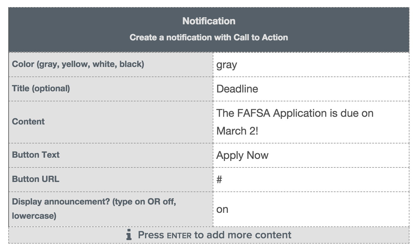
Notification
The Notification Snippet allows you to notify your users of time-sensitive information such as an application window being open, temporary change in hours/office closures, upcoming important deadline, etc. The notification snippet should be reserved for important announcements and should be turned off when the information is no longer relevant.
The notification snippet is available in 4 colors (gray, yellow, white and black).
The Snippet Edit Table for Notification
When in Edit View of the WYSIWYG Editor, the accordion snippet will be displayed as a table.
- Row One of the snippet table is Color. You can change the background color of the notification to gray, yellow, white or black — just type the color you wish to appear.
- Row Two of the snippet table is Title. This is optional and will add small text to the left corner of the notification. Examples of a title would be “Announcement”, “Deadline”, “Office Closure”, etc.
- Row 3 of the snippet table is Content. This is where you add the actual announcement, such as “Our Office will be closed from Dec. 18 - January 5” or “FAFSA Deadline is March 2!”. Keep these short — if more information is needed, the users can follow the button to read more (see step 4).
- Row 4 of the snippet table is Button Text. This is what the Notification button will say (i.e. Learn More or Read More). Again, keep this short — 2 to 3 words max.
- Row 5 of the snippet table is Button URL. Add the dependency tag (internal links) or URL for where the button should take users. Note: to hide the button, leave the URL option blank.
- Row 6 of the snippet table is to display the announcement. If the announcement should display on the page you will type on (all lowercase). If you do not want it to display, type off (all lowercase). Don’t forget to submit the page for publish after you turn it on or off!
Panels
A panel organizes information into a box with an optional header and footer. The style of the panel can change (different background colors, with or without icon) but they all use the same snippet.
The Snippet Edit Table for the Panel has several rows that you will not need. The only rows you need for editing purposes are:
- Header (Optional): This is where you can edit the title of the panel. If this is blank, the header region of the panel will not be displayed
- Content: This is where you can edit the content of that is inside the main region of panel.
Lorem ipsum dolor sit amet, consectetuer adipiscing elit. Donec odio. Quisque volutpat mattis eros. Nullam malesuada erat ut turpis. Suspendisse urna nibh, viverra non, semper suscipit, posuere a, pede.
Lorem ipsum dolor sit amet, consectetuer adipiscing elit. Donec odio. Quisque volutpat mattis eros. Nullam malesuada erat ut turpis. Suspendisse urna nibh, viverra non, semper suscipit, posuere a, pede.
Social Media Icons
The Social Media Snippet is used to include icon links to your various social media platforms. The snippet uses Font Awesome Icons to display the links. Links can be displayed in either red or gray.
The Snippet Edit Table for Social Media Icons
- Each row in the edit table is for a different social media item
- The first column of the table is where you include the Font Awesome Icon. The standard icons you will use are:
- fa-twitter
- fa-instagram
- fa-facebook
- fa-pinterest
- fa-linkedin
- The second column is where you put the link to your social media site. DO NOT add it as an actual link. Just type the URL as standard text.
- The third column is where you can change the icon color by typing “red” or “gray”. Note that you should keep the same color for every icon in the list.
- To add a new social media icon:
- Place your cursor in the last row of the table.
- From the Table Drop-down menu in the toolbar, click Row > Insert Row After
- A new row will appear.
- Using the Font Awesome list above, type in the name of the font awesome icon
- Type the URL to your social media site. DO NOT add it as an actual link. Just type the URL as standard text.
- Enter the color of the icon (remember it should be the same as the other icons on your page.)
Staff Directory
The staff directory allows you to insert a department specific staff directory onto a page. When used, the Staff Directory will automatically pull in the names and contact information from the PCC HR Database. You cannot edit the information in the directory.
If you feel that the staff information showing up is incorrect, please contact Human Resources. If you need help adding a staff directory to your pages, please submit a Web Help Ticket.
Steps List
The Steps List snippet applies a special style to a Ordered List. This snippet is reserved to explain a set of application or registration steps to a user.
To edit a step, simply change the text. Do not copy and paste into a steps list, as it will cause the formatting to break.
To add a new step, hit enter/return from your keyboard. A new step number will appear and you will be able to add text next to it.
- Step 1 Goes Here
- Step 1 Goes Here
- Step 1 Goes Here
Tabs
The Tabs Snippet organizes your content different different panels, and each panel is viewable one at a time. Each panel of content is displayed by clicking the content’s corresponding tab control.
Editing TabsSnippet Edit Table for Tabs
To Edit Existing Tabs and Content:
- Column one of the table is called "Tab Title". This is where you can edit the title of one of your tabs.
- Colum two of the table is called "Tab Content". This is where you can edit that is displayed in that tab.
To add another tab panel:
- Put your cursor in the row above where you want the new tab panel to be added.
- From the toolbar, click on the Table drop-down menu.
- From Row, click Insert Row After.
- You will now see another row added to the Tabs Snippet Edit Table.
- Add your Tab Title in the first column, and Tab content in the third column.
- Repeat this process to add additional rows.
Tab Panel 1
Donec nec justo eget felis facilisis fermentum. Aliquam porttitor mauris sit amet orci. Aenean dignissim pellentesque felis.
Tab Panel 2
Morbi in sem quis dui placerat ornare. Pellentesque odio nisi, euismod in, pharetra a, ultricies in, diam. Sed arcu. Cras consequat.
Tab Panel 3
Pellentesque fermentum dolor. Aliquam quam lectus, facilisis auctor, ultrices ut, elementum vulputate, nunc.
Testimonial Carousel
The Carousel is used to present text information in a “slideshow” fashion. This snippet is reserved for Testimonials.
This is a testimonial. Donec nec justo eget felis facilisis fermentum. Aliquam porttitor mauris sit amet orci.
This is a testimonial. Donec nec justo eget felis facilisis fermentum. Aliquam porttitor mauris sit amet orci.
This is a testimonial. Donec nec justo eget felis facilisis fermentum. Aliquam porttitor mauris sit amet orci.
Snippet Edit Table for Testimonial Carousel
Edit Existing Testimonials
- Each row in the Snippet Edit Table displays one testimonial.
- Column One (Testimonial Content) is where the testimonial goes.
- Column Two (Name) is where you put the name of the person who gave the testimonial. If there is no name, leave blank.
- Column Three (Title) is where you can put a title or additional information about the person who gave the testimonial (i.e. Student, Class of 2016, History Professor, etc.)
Add a New Testimonial
- Put your cursor in the row above where you want the new testimonial panel to be added.
- From the toolbar, click on the Table drop-down menu.
- From Row, click Insert Row After.
- You will now see another row added to the Tabs Snippet Edit Table.
- Add your Tab Title in the first column, and Tab content in the third column.
- Repeat this process to add additional rows.
Toggle
The Toggle Snippet is used to create content that expands/collapses upon click a link or button. You can edit the content in a content by changing the text in the "Toggle Content" row of the Snippet Edit Table.
The is toggle content. It will display when the above button is clicked. You can click the button again to re-hide the content.
Well
The well snippet is used to make aspects of a page stand out. It is very similar to the Panel Snippet, except that it only has one style (gray background) and does not have a footer or header field. You can edit the content inside a well by changing the text in the "Content" row of the Snippet Edit Table.
This is a sample well. Lorem ipsum dolor sit amet, consectetuer adipiscing elit. Donec odio. Quisque volutpat mattis eros. Nullam malesuada erat ut turpis. Suspendisse urna nibh, viverra non, semper suscipit, posuere a, pede.
Go Somewhere!